


Gold World News Flash |
- Biggest Financial Story to 2040
- Very Bullish Pattern in Gold Miner Stocks
- China's Credit, Australia's Gold
- China’s gold demand
- Time To Accumulate Stock Of Gold Stocks?
- This Will Shock The Markets & Send Gold Soaring In 2014
- Supply and Demand Report 16 Feb
- Collapse Of Society In America
- Silver Price Decisive Breakout
- Gold Price Decisive Breakout, Precious Metals Major Uptrend
- Koos Jansen: The end of Bretton Woods and the race to the bottom, 1971
- Is Bitcoin Greatly Rotating Into Bullion?
- GoldSeek Radio's Waltzek interviews Grandich and Murphy
- Bank Of America Warns "The US Dollar Is In Trouble"
- Japan GDP Biggest Miss In 18 Months; Slowest Growth Since Before Second Coming Of Abe
- "From Self-Reinforcing Speculation To Fragile Instability"
- Bank Of America Warns "The US Dollar Is In Trouble"
- Gold And Silver Surge & A Frightening Look Into Our Future
- Jason Hartman-- Economic Collapse 2014
- Agenda 21 -- America's Destruction in Revelations -- Judy Newton
- Time To Accumulate Stock Of Gold Stocks?
- Guillermo Barba interviews GATA Chairman Murphy on gold market manipulation
- Bitcoin Craptocurrency Ponzi Crash Grinds Towards ZERO, Where's Max Keiser Hiding?
- Gold at $10,000, $50,000 or $100 trillion?
- Taking Stock Of Gold Stocks – ANV, NGD, AUY, FCX, NEM, AEX, GDX
- Gold Is Money: Utopia Or Reality?
| Biggest Financial Story to 2040 Posted: 17 Feb 2014 01:05 AM PST What happens to America's debt? Stay tuned... LAST WEEK there was no follow through to Tuesday's strong showing in the US stock market, writes Bill Bonner in his Diary of a Rogue Economist. The Dow flatlined, gold rose above the $1300-an-ounce mark. US stocks don't seem to know what direction they want to go. Gold seems to want to go up. Our guess is that gold won't go up much...not yet. There's little inflation pressure (officially measured, at least). And the expectation that QE would lead to higher prices has largely faded from investors' imaginations. The more experience we have of the Fed's "improv" policies, the more we realize that they stimulate neither a genuine economic recovery...nor genuine inflation. We're in Japan, in other words. And we may be there for a long, long time. Buenos Aires will have to wait! Yesterday, the Senate went along with the House. No debt ceiling problems this year, it said. Government finances are looking better. January's deficit was only $10 billion – down from $100 billion for the same period a year ago. The Congressional Budget Office is calling for a $514 billion shortfall for this year...and a $478 billion deficit in 2015. That's good news, isn't it? Well...it depends on your point of view. Deficits are a way for the feds to waste money on their favorite projects. Billions for the bankers. Billions for retirees. Billions for the weak and the lame. Take away these billions, and we're better off in the long run. Government spending is consumed, not invested. It does little to build a real economy. But deficits are also "stimulus". When the banks won't lend, and citizens won't borrow, deficit spending is about the only way to get money into the hands of consumers. In the short run at least, this money keeps the lights on and the wheels turning. Economists are simpletons. They believe this spending by the government is as good as spending by the private sector. Nor can they tell the difference between demand that comes from real people, with real money they get from real wages...and the 'demand' that comes from borrow-and-spend policies, helped along by the Fed's artificially low interest rates. The difference is critical. One leads to real growth and wealth. The other leads to a disastrous debt bubble and poverty. But remember, that's the long run. In the short run, we're in a spell of Tokyo-style deleveraging. And the Fed's QE and ZIRP policies have not been enough to break the private sector's resistance to taking on more debt. As in Japan, only government – bless its stupid, shriveled little heart – goes deeper into debt. Already, the feds have more debt than they can repay. The biggest financial story of the next quarter century will be what happens to that debt. |
| Very Bullish Pattern in Gold Miner Stocks Posted: 17 Feb 2014 01:00 AM PST If this uptick persists, how much can GDX and GDXJ gain in 2014...? In RECENT MONTHS we compared the bear market in gold miner stocks to bear markets of the past, writes Jordan Roy-Byrne at TheDailyGold. Readers were probably getting sick of seeing our bear analogs chart which made the case that a major bottom was coming. The good news is the major bottom is in and now we can compare the current recovery with past recoveries. Gold miner-stock indexes GDX and GDXJ continue to form a very bullish bottoming pattern and we want to see how their measured targets (and potential upside) mesh with historical recoveries. The following chart plots GDX and GDXJ as well as their 400-day moving average, one of my favorite long-term moving averages. 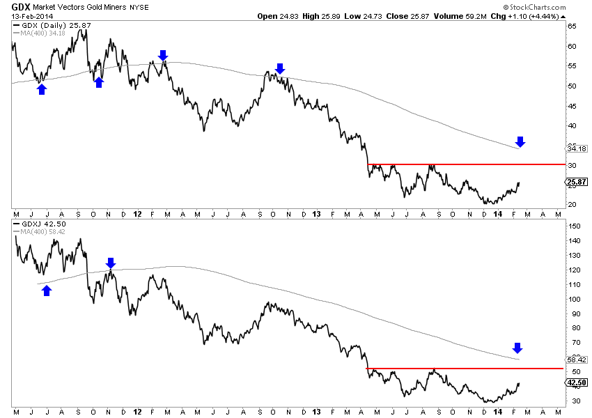 Both markets could be forming reverse head and shoulder bottoming patterns. The necklines are the next resistance targets at $30 for GDX and $51 for GDXJ. These targets could coincide in the near future with the declining 400-day moving averages. The left shoulder of the pattern was formed in June 2013 and the head was formed in December. The right shoulder could be formed from a pullback from those aforementioned targets. The pattern projects to upside targets of $40 for GDX and $73 for GDXJ. Next, we plot the same markets on a monthly chart. The next major (or multiyear) resistance for GDX and GDXJ are essentially the same upside targets from the potential head and shoulders patterns. 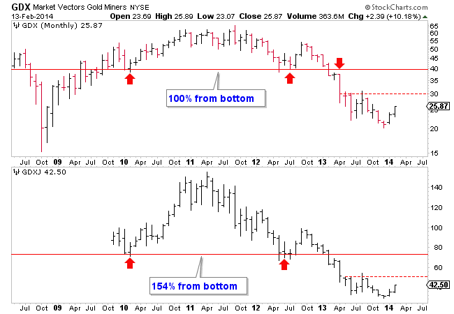 The targets equate to a 100% rebound for GDX and over a 150% rebound for GDXJ. This seems excessive but history argues otherwise. In the chart below we plot the average rebound in gold stocks from major bottoms within secular bull markets. In black we plot the average of the 2000, 2005 and 2008 rebounds and in blue we plot the average of the 1970 and 1976 rebounds using the Barron's Gold Mining Index. 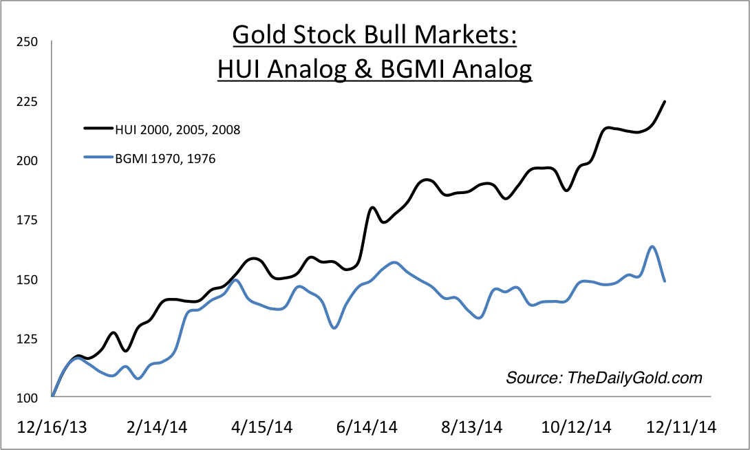 Over the past decade, the HUI averaged a 125% rebound in 12 months while the BGMI averaged about a 60% rebound. We should note that the HUI is a more volatile and leveraged index than the BGMI. A 60% rebound in the BGMI could equate to a 75% rebound in the HUI. GDXJ does not have as much of a history but thanks to Bob Hoye we can see how it performed following the 2008 and 2005 bottoms. He took the GDXJ components and weightings from 2009 and projected it back to 2004. GDXJ rebounded over 200% following both the 2005 and 2008 bottoms. The chart is Bob's and the annotations are ours. 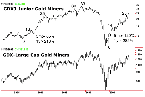 Historical analysis shows that the potential upside targets of GDX $40 and GDXJ $73 could be achieved by the end of this year. That would mark a 100% gain for GDX and over 150% rebound for GDXJ in one year. Forecasting these gains is perfectly reasonable given history. A one year gain of 100% in GDX would be below the average of the one-year rebounds in 2000, 2005 and 2008. A gain of 150% in one year for GDXJ would be below what its performance following the 2005 and 2008 bottoms. Any pullback, we think, would create a buying opportunity for those who have missed out and set up the right shoulder of the inverse head and shoulders pattern. Both the short and intermediate term outlook for gold and silver stocks continues to be very positive. |
| China's Credit, Australia's Gold Posted: 17 Feb 2014 12:53 AM PST Tremors across the world from rising Shanghai interest rates... GOOD NEWS for stocks in the US last week, writes Greg Canavan at The Daily Reckoning Australia. Both retail sales and employment data were disappointing. Retail sales fell 0.4% in January and a revised 0.1% in December, while jobless claims unexpectedly rose too. How is that good for stocks, you ask? It means more monetary sugar for longer. At least that is what the market is punting on. Actually, it's what the market has solely punted on for years. All the chips are on red...or black...or whatever. It's a bet on more asset price inflation. Meanwhile, the world's second largest economy is on the verge of a major credit deflation, a fact the developed markets continue to wilfully ignore. Why are they ignoring it? As we mentioned earlier this week, it appears as though 'core' stock markets are benefiting from safe haven capital flows as hot money exits the rapidly cooling emerging markets. But there will be no safe haven from the looming deflation of the biggest emerging market of all – China. The world is too globalised and interconnected. The precursor to nearly all credit bubble deflations is higher interest rates, and you're seeing that in China now. Shanghai's interbank rates of interest spiked higher in December and stayed there, up nearly one percentage point to 5.6%. Letting this happen reflects the determination of the People's Bank of China (PBoC) to get China's credit boom under control. Whether it can actually do so is another question. Higher interest rates certainly will slow things down, but it will also highlight the hundreds of billions of malinvestment made in China in recent years. You should hope the PBoC get this right. The system is too big for it to lose control. Ambrose Evans-Pritchard, writing for The Telegraph in London, says:
But the big issue is how tighter credit in China could transmit to the rest of the world.
Just to be clear on how this works, attempts to slow credit growth aren't working so far because foreign currency inflows are filling the gap. It's thought that businesses are borrowing cheap US Dollar loans via Hong Kong and ploughing the proceeds into short-term, high-yielding wealth management products. But it's not all bad news. Not yet anyway. Profit results in Australia have been decent so far and profits and profitability are what drives the stock market. Our only quibble is that stocks are not pricing in a skerrick of the rapidly rising and considerable risk in the economy of our largest trading partner. Take 'diversified' miner Rio Tinto for example. It reported a much improved annual result, with cost cutting proving the feature. Underlying earnings hit US$10.2 billion for 2013. But it was all thanks to the iron ore division which contributed underlying earnings of US$9.86bn. Rio looks well priced, trading on about 10 times 2014 expected earnings. But rapidly declining iron ore prices will severely damage those expectations. It reminds us of the way the market priced the homebuilders in the US prior to housing bust. The largest builders all traded on single-digit price/earnings (PE) ratios. Were they cheap, or a value trap? Clearly they turned out to be very big value traps. If you look at the big iron ore miners today, they'll all trading on low to single-digit PEs. Fortescue for example trades around five times 2014 expected earnings. Value or value trap? We think the latter, but who really knows? What we do know however is that at resource cycle peaks and troughs the market is pretty consistent at how it prices companies. For example, at the bottom of the cycle many companies will look expensive based on forward estimates because analysts are not anticipating higher future profits. They always upgrade profit expectations well after the cycle has turned. At cycle peak, however, company's trade on low PEs for the very same reason. Analyst profit expectations remain robust out into the future, as they don't anticipate the cycle turn...they only follow it down. With that in mind, consider that Australia's largest gold miner, Newcrest, is trading on a forward PE of around 28 times, while Fortescue is on five times. Is that the market giving you a pretty good indication of where the respective cycles are right now for iron ore and gold? We think it is. |
| Posted: 16 Feb 2014 10:35 PM PST Finance and Eco. |
| Time To Accumulate Stock Of Gold Stocks? Posted: 16 Feb 2014 10:30 PM PST by Michael Noonan, Gold Silver Worlds:
What we know about charts is that they do not lie and most accurately depict conditions and character for each time frame and for any given stock or futures activity. You can actually see how markets develop into trading opportunities, as well as when to avoid committing money. Charts capture the essence of timing so lacking in fundamentals. |
| This Will Shock The Markets & Send Gold Soaring In 2014 Posted: 16 Feb 2014 09:01 PM PST  On the heels of unprecedented actions being taken across the globe, today a 40-year market veteran sent King World News a fascinating piece which exposes what will shock the markets and send gold soaring in 2014. Robert Fitzwilson, who is founder of The Portola Group, put together the following tremendous piece below exclusively for King World News. On the heels of unprecedented actions being taken across the globe, today a 40-year market veteran sent King World News a fascinating piece which exposes what will shock the markets and send gold soaring in 2014. Robert Fitzwilson, who is founder of The Portola Group, put together the following tremendous piece below exclusively for King World News.This posting includes an audio/video/photo media file: Download Now |
| Supply and Demand Report 16 Feb Posted: 16 Feb 2014 08:22 PM PST The dollar dropped a lot more this week than it has in any one week for a long time. Measured conventionally, the gold price spiked $51, and the silver price by $1.47. Gold owners have 4% more dollars, and silver owners have 7.4% more dollars. However, those dollars are worth less. How much less? To calculate the value of the dollar (or anything else), we can't use consumer prices. This is because consumer prices are constantly falling, in real terms. Consumer prices are falling because industry is constantly pushing itself to be more efficient. Gold is the closest thing to a constant value in the economic universe, the equivalent of the speed of light in a vacuum, C. The dollar went from 24.55mg gold to 23.59mg, a loss of 3.9%. If you have 4% more of something worth 3.9% less, you are exactly even (trust me on the math, if you don't remember those cases of percent from 9th algebra class). Or another way of thinking of it is that your wealth went from one ounce to one ounce of gold, a change of 0%. The profit is illusory, an artifact of measuring money (i.e. gold) in terms of falling credit (i.e. dollars). Unfortunately, if you sell your gold to take your phantom profits, you are subject to taxes, at least in the US. The IRS believes that your gain is real. They will take perhaps a third of it, and the state tax authority will take more. Unless you used leverage, if you traded this spike then you have taken a loss when you account for taxes. Bummer. Silver is a different picture. The silver price went up 7.4% in dollar terms, or 3.2% in gold terms. A week ago Friday, it took 63.4oz of silver to buy an ounce of gold. Now it takes only 61.5oz. We won't do the arithmetic here, but silver speculators likely did make a small profit, even after they net out taxes. Congratulations. Now be aware that while the price of silver may have shot up, the supply and demand picture hasn't changed much. Leveraged speculators went on tilt this week. Could they go get crazier next week? Absolutely. This is why we always say never naked-short a monetary metal! We can only emphasize that unless the fundamentals in silver change in a big way, the silver price is likely headed for a big fall. We estimate that the neutral price for silver has risen only slightly, to around $18.60. When the exuberance and leverage (or access to credit) dries up, the price could fall back even faster than it rose. It could overcorrect, too. If speculators push it as far below the neutral line as they have pulled it above, that would put it at $15.75. It's something to think about, while picking up those silver pennies in front of the steamroller. Anyways, here is the graph of the metals' prices.
We are interested in the changing equilibrium created when some market participants are accumulating hoards and others are dishoarding. Of course, what makes it exciting is that speculators can (temporarily) exaggerate or fight against the trend. The speculators are often acting on rumors, technical analysis, or partial data about flows into or out of one corner of the market. That kind of information can't tell them whether the globe, on net, hoarding or dishoarding. One could point out that gold does not, on net, go into or out of anything. Yes, that is true. But it can come out of hoards and into carry trades. That is what we study. The gold basis tells us about this dynamic. Conventional techniques for analyzing supply and demand are inapplicable to gold and silver, because the monetary metals have such high inventories. In normal commodities, inventories divided by annual production can be measured in months. The world just does not keep much inventory in wheat or oil. With gold and silver, stocks to flows is measured in decades. Every ounce of those massive stockpiles is potential supply. Everyone on the planet is potential demand. At the right price. Looking at incremental changes in mine output or electronic manufacturing is not helpful to predict the future prices of the metals. For an introduction and guide to our concepts and theory, click here. Here is a graph of the gold price measured in silver, otherwise known as the gold to silver ratio.
For each metal, we will look at a graph of the basis and cobasis overlaid with the price of the dollar in terms of the respective metal. It will make it easier to provide terse commentary. The dollar will be represented in green, the basis in blue and cobasis in red. Here is the gold graph.
The April contract had been in a slight backwardation. Not any more. As the dollar has dropped, the cobasis has dropped a bit. Now it's -0.11%. We're still bullish on gold, and our estimate of the neutral price has risen $30, to over $1420. This does not mean the price must rise next week (though it seems likely, based on the technicals). Now let's look at silver.
Look at that drop in the cobasis! It is worth noting that we are now but a few weeks away from First Notice Day, and we are in the thick of the contract roll right now. Most who had the March silver contract must sell, as they don't have the cash to take delivery. If they wish to remain long silver, they can buy May or some other month. This relentless selling of the March contract places downward pressure on its bid. Look at the math. Basis = Future(bid) – Spot(ask) Cobasis = Spot(bid) – Future(ask) Heavy and protracted selling of the contract headed towards expiry should cause a falling basis. The market makers will bring down the ask, to keep a consistent spread. The net result is a basis that falls off the bottom of the chart and a rising cobasis. This is precisely the pattern of temporary backwardation that we have been documenting in the new normal, post-2008. Despite this selling pressure on the March contract, the basis is rising and cobasis is falling. How much would speculators have to buy to cause this, so close to contract expiry? A lot. The same pattern is occurring for the May, and July contracts.
© 2014 Monetary Metals |
| Collapse Of Society In America Posted: 16 Feb 2014 06:45 PM PST Our global economy, reckless in its use of all resources and natural systems, shows many of the indicators of potential failure that brought down so many civilisations before ours. Industrial civilisation is currently "completely dependent on the availability of cheap energy. Therefore,... [[ This is a content summary only. Visit http://www.GoldSilverNewsBlog.com or http://www.newsbooze.com or http://www.figanews.com for full links, other content, and more! ]] |
| Silver Price Decisive Breakout Posted: 16 Feb 2014 06:34 PM PST Silver has confirmed gold's breakout of several days ago by following suit and breaking out above important resistance on Friday on the strongest volume for almost 6 months. This means that we are now in a full on Precious Metals sector uptrend, which is still in its earliest stages. |
| Gold Price Decisive Breakout, Precious Metals Major Uptrend Posted: 16 Feb 2014 06:29 PM PST Gold broke out decisively last week from its downtrend dating back to last August, a development that was confirmed by a dramatic high volume breakout by silver on Friday. On its 8-month chart we can see that gold broke out both from its downtrend and also from a Head-and-Shoulders bottom. It even managed to close above its 200-day moving average on Friday, although the fact that this average is still falling coupled with an overbought reading on its RSI indicator may lead to gold consolidating a little before it makes further gains. Overall though this is a very positive picture, with a clear breakout, and a now rising 50-day moving average that will lead to a bullish moving average cross if gold can hold its gains made so far or if it advances further. |
| Koos Jansen: The end of Bretton Woods and the race to the bottom, 1971 Posted: 16 Feb 2014 06:23 PM PST 9:20p ET Sunday, February 16, 2014 Dear Friend of GATA and Gold: Gold researcher and GATA consultant Koos Jansen muses tonight about U.S. State Department minutes from 1971 showing Secretary of State Henry Kissinger negotiating the devaluation of the dollar with French President Georges Pompidou, with much of the conversation involving the revaluation of gold. Some market analysts believe that Western governments no longer have confidential discussions about rigging the currency markets, dismissing suspicions of that kind of thing as "conspiracy theory." But many State Department records, including those cited tonight by Jansen, show that it is all conspiracy fact. Jansen's commentary is headlined "The End of Bretton Woods and the Race to the Bottom, 1971" and it's posted at Jansen's Internet site, In Gold We Trust, here: http://www.ingoldwetrust.ch/the-end-of-bretton-woods-and-the-race-to-the... CHRIS POWELL, Secretary/Treasurer ADVERTISEMENT A Personal Touch in Buying Precious Metals If you've not secured your allocation of precious metals and numismatic coins, 2014 may be the last year to get them at affordable and undervalued prices. With huge amounts of gold leaving the West for Asia, the future availability of precious metals is very much in doubt. All Pro Gold has competitive pricing on all bullion and numismatic products -- and offers prompt delivery too. Long-time GATA supporters Fred Goldstein and Tim Murphy are glad to answer any questions or concerns about acquiring the monetary metals. All Pro Gold has an extensive electronic library of articles from the world's top market analysts. Learn more at www.allprogold.com or write to Fred and Tim at info@allprogold.com or telephone them at 1-855-377-4653. Join GATA here: Mines and Money Hong Kong http://www.minesandmoney.com/hongkong/ * * * Support GATA by purchasing DVDs of our London conference in August 2011 or our Dawson City conference in August 2006: http://www.goldrush21.com/order.html Or by purchasing a colorful GATA T-shirt: Or a colorful poster of GATA's full-page ad in The Wall Street Journal on January 31, 2009: http://gata.org/node/wallstreetjournal Help keep GATA going GATA is a civil rights and educational organization based in the United States and tax-exempt under the U.S. Internal Revenue Code. Its e-mail dispatches are free, and you can subscribe at: To contribute to GATA, please visit: ADVERTISEMENT Jim Sinclair holds seminars in Los Angeles and San Diego
http://www.jsmineset.com/qa-session-tickets/ |
| Is Bitcoin Greatly Rotating Into Bullion? Posted: 16 Feb 2014 06:16 PM PST While correlation is not causation, the coincidental timing of the tumble in virtual currencies and the surge in physical (alternative) currencies suggests another great rotation may be occurring... with gold at fresh 3-month highs as Bitcoin presses 3-months lows...
While not surprising, the chart above also shows the massive collapse in Mt.Gox pricing as the world and their virtual pet rabbit run for the exits...
Gold is now up over 12% from the post-Taper lows...
and Silver is exploding higher... up 15.6% now in February alone.
Charts: Bloomberg and Bitcoinwisdom |
| GoldSeek Radio's Waltzek interviews Grandich and Murphy Posted: 16 Feb 2014 06:00 PM PST 9p ET Sunday, February 16, 2014 Dear Friend of GATA and Gold: Gold market manipulation and GATA's work figure heavily in the interviews done this week by GoldSeek Radio's Chris Waltzek with market analyst Peter Grandich and GATA Chairman Bill Murphy. Grandich's segment begins at about the 28-minute mark and Murphy's at the 52-minute mark at GoldSeek Radio here: http://news.goldseek.com/radio/1392602400.php CHRIS POWELL, Secretary/Treasurer ADVERTISEMENT A Personal Touch in Buying Precious Metals If you've not secured your allocation of precious metals and numismatic coins, 2014 may be the last year to get them at affordable and undervalued prices. With huge amounts of gold leaving the West for Asia, the future availability of precious metals is very much in doubt. All Pro Gold has competitive pricing on all bullion and numismatic products -- and offers prompt delivery too. Long-time GATA supporters Fred Goldstein and Tim Murphy are glad to answer any questions or concerns about acquiring the monetary metals. All Pro Gold has an extensive electronic library of articles from the world's top market analysts. Learn more at www.allprogold.com or write to Fred and Tim at info@allprogold.com or telephone them at 1-855-377-4653. Join GATA here: Mines and Money Hong Kong http://www.minesandmoney.com/hongkong/ * * * Support GATA by purchasing DVDs of our London conference in August 2011 or our Dawson City conference in August 2006: http://www.goldrush21.com/order.html Or by purchasing a colorful GATA T-shirt: Or a colorful poster of GATA's full-page ad in The Wall Street Journal on January 31, 2009: http://gata.org/node/wallstreetjournal Help keep GATA going GATA is a civil rights and educational organization based in the United States and tax-exempt under the U.S. Internal Revenue Code. Its e-mail dispatches are free, and you can subscribe at: To contribute to GATA, please visit: ADVERTISEMENT Jim Sinclair plans seminars in Los Angeles and San Diego Gold advocate Jim Sinclair's next market analysis seminars will be held in Los Angeles from 11 a.m. to 2 p.m. on Saturday, March 8, and in San Diego from 2 to 6 p.m. the following day, Sunday, March 9. Details, including registration information, are posted at Sinclair's Internet site, JSMinset.com, here: http://www.jsmineset.com/qa-session-tickets/ |
| Bank Of America Warns "The US Dollar Is In Trouble" Posted: 16 Feb 2014 05:58 PM PST
Gold breaks pivotal resistance Global financial and commodity markets are warning that the US Dollar is in for a bout of trouble, warns BofAML's Macneil Curry. Across asset classes, Curry points out that Gold was the first to make its low against the US Dollar, doing so back on Dec-15. The second market to turn against the US Dollar was US Treasuries, with Ten year note futures turning bullish back on Dec-26. Currently, the FX market - most specifically GBP - is breaking out and pressuring the US Dollar. Finally, the Japanese stock market continues to suffer, putting downward pressure on USDJPY and thus US Dollar weakness. Via BofAML's Macneil Curry, to read this article in full please click here. In September 2011 the Gold Bugs index, the HUI stood at 630 as gold prices peaked, since then both have trended lower with the HUI losing about 65% of its value. The bottom has been called a number of times and after such a dramatic decline its difficult not to think that we are there now. However, as we all know the timing of any investment is crucial to its success and that is exactly what we are trying to do here, trying to pick advantageous entry and exit points. If you would like to know which stocks we are buying and selling please join us at ‘Stock Trader’ our premium investment service. Subscribe for 12 months with recurring billing - $199 Buy 12 months of subscription time - $199
If you are new to investment in the precious metals sector then you can subscribe of our FREE newsletters regarding gold stocks, silver stocks and uranium stocks, just click on the links and enter your email address and we will email you our articles along with other interesting posts. Please remember to check your spam folder once you have subscribed to ensure that our verification has not gone astray.
|
| Japan GDP Biggest Miss In 18 Months; Slowest Growth Since Before Second Coming Of Abe Posted: 16 Feb 2014 04:13 PM PST Get long 'Depends' may be the most befitting headline for tonight's massive macro miss in Japan. For the 3rd quarter in a row, Japanese GDP missed expectations with a meager +1.0% growth (versus a +2.8% expectation), this is the biggest miss and slowest growth since Abe retook the economic throne after his chronic-diarrhea-prone first attempt to save the nation. No matter how hard they try to spin this, there's no silver lining as consumer and business spending missed expectations notably... and this is before a tax hike that is aimed at showing how fiscally responsible the nation and not simply an insolvent ponzi scheme alive through the good graces of the greater fools of leveraged carry trades.
Japanese GDP... oops
For a few brief hours there, Japanese stocks bullishly disconnected from USDJPY, then reality hit and it caved...
Think that Ito's earlier comments on the nation's pension fund allocations will save them: *GPIF SHOULD INCREASE ANNUAL RETURN TARGET TO 5%, ITO SAYS *JAPAN'S GPIF SHOULD PUT HALF ASSETS IN STOCKS, ITO SAYS *GPIF SHOULD CUT BOND HOLDINGS TO 40% WITHIN TWO YEARS: ITO
Think again - for as obviously bulltarded as those statements are.. As The FT reports,
So it seems the last sane voice in Japan just explained the un-independence of everything that is occurring... and remember, as Kyle Bass once wrote,
Charts: Bloomberg |
| "From Self-Reinforcing Speculation To Fragile Instability" Posted: 16 Feb 2014 03:39 PM PST While the only fun-durr-mentals that matter appear to be global central bank liquidity injections (and thus the level of leverage entrusted to the JPY carry trade), the crowd is swayed by truthisms and "common knowledge" memes that recovery is here, that things are improving, that earnings are 'solid', that markets are still cheap, and that historical analogs are different this time. However, with monetary policy at a turning point, we also appear (fundamentally and technically) to be at "the inflection point from self-reinforcing speculation to fragile instability." Earnings expectations are crumbling...
Just as they have done year after year from the totally unbiased and independent folks at your friendly local sell-side strategy shop
As companies continues to guide down en masse...
But hope remains that margins will save the day...
And the herd has hardly ever been more tightly packed (dispersion of forward-earnings estimates is near record lows)
As Forward P/Es remain on the high-side...
And worryingly, given the current level of Forward P/Es, any shift in rates is a negative for multiple-expansion...
Which suggests the only thing that can help multiples is moar confidence... s a gentle reminder, as we have noted previously - this move in confidence is key... But, it's all about confidence... investors will not be willing to pay increasing multiples unless they are confident that the future streams of earnings are sustainable and forecastable... And simply put, the current levels of Consumer Sentiment need to almost double for the US equity market tp approach historical multiple valuation levels...
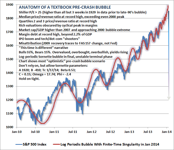
Good luck with that... and while this week's "reflexive" bounce has many proclaiming the worst behind us, John Hussman has some historical analogs worth sharing that shed an uncomfortable light on how far we have come and where we go next... ...the potential for short-term gains is overwhelmed by the risk of deep cyclical and secular losses. in the context of log-periodic bubbles – as we've observed in U.S. equities since 2010 (see The Diva is Already Singing) – the "critical point" or "finite time singularity" is not a crash date, but the inflection point from self-reinforcing speculation to fragile instability. Didier Sornette observed this more than a decade ago in Why Stock Markets Crash. Our best estimate of that inflection point remains about January 13. It's also worth remembering that the "catalysts" associated with sharp market losses have often been fully recognized only after the fact, if at all. As Sornette emphasized, "The collapse is fundamentally due to the unstable position; the instantaneous cause of the crash is secondary." The following chart is reprinted from our November 11, 2013 weekly comment A Textbook Pre-Crash Bubble. What is important, in my view, is not simply the log-periodic structure, but the broad array of additional classic speculative features that emerged as the market approached its recent highs.
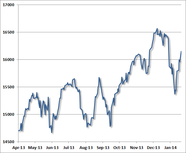
A few months ago, Bill Hester examined a century of price data, and observed that the non-overlapping periods most closely correlated with the past 5-year trajectory of the S&P 500 were the advances preceding the 2007, 2000, 1987, 1937 and 1929 market peaks. This shouldn't be a surprise – the past 5-years have largely resembled a diagonal line, as did the advances to those extraordinary market peaks. Diagonal lines always have a nearly perfect correlation even if there is some amount of variation along the way. Again, we would dismiss historical analogs like this if the recent market peak did not feature the "full catastrophe" of textbook speculative features – particularly the same syndrome of extreme overvalued, overbought, overbullish, rising-yield conditions observed (prior to the past year) only at major market peaks in 2007, 2000, 1987, 1972, and 1929. The main temptation to ignore this concern is that similarly extreme conditions emerged in both February and May 2013 without consequence. Less extreme variants of this syndrome have also emerged periodically in the past few years (these variants also capture 1937 and a few other bull market peaks, as well as the April 2011 peak after which the market briefly retreated by nearly 20%). Overall, my view continues to be that the consequences of the more recent instances have not been avoided, but merely deferred – and those consequences will be worse for it. To offer some perspective of how major peaks have typically evolved, the following charts present the Dow Jones Industrial Average in the final advances toward, and the few weeks after, what turned out in hindsight to be major stock market peaks. For reference, let's examine the recent market peak. Notice several features:
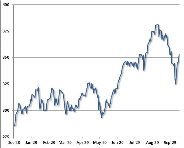
One can observe that same general dynamic in the chart below – a series of moderately-spaced peaks forming a largely sideways consolidation, a breakout to a steep and only briefly corrected speculative "blowoff", an initial retreat, and finally a reflex rally. This chart depicts the final advance to the 1929 market peak.
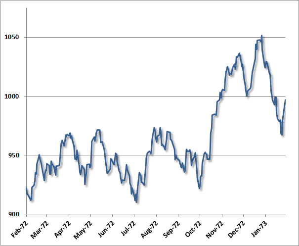
Largely the same dynamic was evident in the advance to the 1973 peak (after which the market lost half its value into late-1974): a series of moderately-spaced peaks comprising a broad consolidation, a breakout to a steep and only briefly corrected speculative blowoff and market peak, a steep initial decline, and a short-lived reflex rally after the peak.
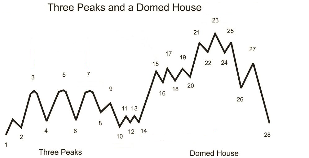
As it happens, the sequence described here is not at all new. Instead, it follows a pattern that technical analyst George Lindsay described in 1970 (and notably before even the 1973 instance above), which he called "Three Peaks and a Domed House." Lindsay observed this pattern repeatedly across historical market cycles, describing about half of the bull market tops in the DJIA. My sense is that it is enormously ambitious to label 28 separate points in a technical pattern, but the central observations do appear to nicely characterize many historical instances. Lindsay called points 8-10 a "separating decline" that distinguishes the series of consolidating peaks from first vertical portion of the speculative blowoff (the "wall of the first story"). Following a choppy correction, the pattern completes with the "domed house" – which is roughly the analog of a narrow head-and-shoulders pattern: "after peaking at 25, price tumbles to 26, retraces to 27, before heading lower to 28, completing the pattern."
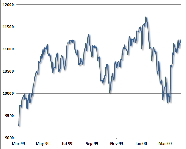
(chart and background h/t Claasen Research, James Goode, Thomas Bulkowski) Though the "separating decline" after the mid-1999 consolidation was quite deep, as was the initial decline from the January 2000 peak in the Dow Industrials, the same essential features were evident then as well. The correspondence isn't nearly as pretty as in the present instance, or those of 1973 or 1929. It's worth keeping in mind that despite a hard initial decline, many (though not all) historical bull market peaks include an "exhaustion rally" anywhere between 2-9 months after the market peak, which can carry prices within a few percent of the high. The problem is that there is too much variability to count on either their timing or extent.
From the standpoint of investor psychology, it seems understandable that the speculative enthusiasm and short-covering that contributes to bull market tops is fueled when the market "breaks out" after a period of consolidation (and what Lindsay called a "separating decline"). The blowoffs that followed – both recently and in the examples above – were accompanied by clear overvaluation on reliable measures, and also featured clearly defined overbought conditions and lopsided bullish sentiment. I'll say this yet again, because it's a crucial point – we would have zero interest in historical analogs like this if the recent market peak was not also accompanied by an extreme overvalued, overbought, overbullish, rising-yield syndrome that – prior to the past year - has emerged only at major market peaks. As with the recent log-periodic bubble, the pattern itself should be simply be treated like an interesting experiment. Lindsay's and Sornette's observations are largely consistent in that Lindsay's pattern is basically a slightly irregular refinement of the very end of a Sornette bubble. The "three peaks" of Lindsay's pattern correspond to log-periodic oscillations, and the left side of the "domed house" is essentially a final blowoff and short squeeze featuring much shallower fluctuations approaching the high. Without tracing through over a century of price data for every instance (including "setups" that did not follow through), we can't say categorically that this pattern is always followed by market losses. What one can say is that when Lindsay's pattern has been accompanied by rich valuations (say, a cyclically adjusted P/E over 18), the market has typically been at the cusp of a significant retreat. Those periods of rich valuations are easily identified, and the corresponding blowoff patterns emerge in 1901-02, 1906, 1929, 1937, 1961, 1966, 1969, 1972-73, 1987, 1998, 2000, and today. The 2007 peak had less fidelity to Lindsay's pattern because the reflex rally in October slightly exceeded the July peak of that year. Of course, lopsided bullish sentiment – as we observed in December and January – further narrows the set and worsens the average outcome, as do razor-thin risk premiums on corporate debt, soaring margin debt, and severely overbought conditions following a largely-uncorrected multi-year market advance. It's not any single pattern that concerns us here, but rather the entire syndrome of classic speculative features that accompanied the recent peak – in the words of Zorba the Greek, "the full catastrophe." In any event, our present investment outlook certainly doesn't derive from or rely on such patterns, and are much more related to a broad ensemble of evidence that we can validate over a century of market data. As I've noted in numerous prior weekly comments, 1929, 1972-73, 1987, 2000, 2007, and recent market highs belong to a rather exclusive group of instances featuring a similarly extreme syndrome of overvaluation (based on normalized measures that are well-correlated with subsequent 7-10 year market returns, such as 10-year inflation-adjusted earnings, price/revenue, and market capitalization / GDP); overbought conditions (based on the extent and duration of price advances); strikingly overbullish sentiment (based on the proportion of advisory bulls versus bears over a period of weeks); and typically rising interest rates (for example, 10-year Treasury yields above their level of 6 months prior).
Market cycles often display regularities, but investors should never conclude that they follow precise rules... but QE provides a potetial catalyst to prove it's not different this time...
|
| Bank Of America Warns "The US Dollar Is In Trouble" Posted: 16 Feb 2014 01:34 PM PST Global financial and commodity markets are warning that the US Dollar is in for a bout of trouble, warns BofAML's Macneil Curry. Across asset classes, Curry points out that Gold was the first to make its low against the US Dollar, doing so back on Dec-15. The second market to turn against the US Dollar was US Treasuries, with Ten year note futures turning bullish back on Dec-26. Currently, the FX market - most specifically GBP - is breaking out and pressuring the US Dollar. Finally, the Japanese stock market continues to suffer, putting downward pressure on USDJPY and thus US Dollar weakness. Via BofAML's Macneil Curry, Gold breaks pivotal resistance
Across assets gold has been the lead market against the US $; having forged its base back in mid December. Now, it has broken above its 150d average (1295) for the 1st time since Jan'13. This average has been an excellent barometer of the medium term trend and points to further gains. We target the confluence of resistance between 1355/1374 and potentially beyond. US Ten Year Notes futures set to make new highs
The TYH4 corrective pullback from its Feb-03, 126-16 high, coupled with the hold of its 21d moving average (now 125-10) says the year-to-date uptrend remains intact. When combined with an increasingly bullish backdrop for risk, this is bearish the $. £/$ is on the edge of a major breakout
A closing break of the1.6748, Apr'11 high, would mark the end of a 4yr contracting range and target further upside towards long term pivots at 1.7145/1.7167. This could also prove to be the catalyst for €/$ to break key resistance at 1.3737 and the US $ Index to break key support at 79.68; all of which would be very bad for the $. A bearish Nikkei is trouble for $/¥
The Nikkei remains in a medium term bear trend, with the break of the 100d (now 14,988) pointing to further near term weakness. We continue to target the summer 2013 lows at 13,388/14,415 before the long term bull trend can resume its footing. This Nikkei weakness is likely to maintain downward pressure on $/¥ given their strong positive correlation. For the currency pair, watch the Feb-07 post NFP low at 101.54. Through here opens the 200d at 100.21 and below. |
| Gold And Silver Surge & A Frightening Look Into Our Future Posted: 16 Feb 2014 11:50 AM PST  Today a man who has lived in 18 countries around the world, and witnessed collapses in many of these countries firsthand, spoke with KWN about the gold and silver surge, and also gave us a frightening look into our future. Keith Barron, who consults with major companies around the world and is responsible for one of the largest gold discoveries in the last quarter century, also shared fascinating firsthand experience in Argentina. Today a man who has lived in 18 countries around the world, and witnessed collapses in many of these countries firsthand, spoke with KWN about the gold and silver surge, and also gave us a frightening look into our future. Keith Barron, who consults with major companies around the world and is responsible for one of the largest gold discoveries in the last quarter century, also shared fascinating firsthand experience in Argentina.This posting includes an audio/video/photo media file: Download Now |
| Jason Hartman-- Economic Collapse 2014 Posted: 16 Feb 2014 11:30 AM PST Jason Hartman and I discussed the possibility of an economic collapse in the US and abroad. Jason thinks it's unlikely, whereas I believe it's becoming more likely by the day. Unfortunately, there's no timetable for this eventuality, so you've got to act as if it's never going to happen, while... [[ This is a content summary only. Visit http://www.GoldSilverNewsBlog.com or http://www.newsbooze.com or http://www.figanews.com for full links, other content, and more! ]] |
| Agenda 21 -- America's Destruction in Revelations -- Judy Newton Posted: 16 Feb 2014 10:15 AM PST Judy Newton, the author of The Whore of Babylon joins me on the Prepper Recon Podcast to tell us why she believes Revelation speaks about the destruction of America. She explains how Agenda 21, Common Core, The NSA and a global currency collapse are all connected to bring about the kingdom of... [[ This is a content summary only. Visit http://www.GoldSilverNewsBlog.com or http://www.newsbooze.com or http://www.figanews.com for full links, other content, and more! ]] |
| Time To Accumulate Stock Of Gold Stocks? Posted: 16 Feb 2014 08:53 AM PST We often see comments to the effect of interest in gold miner stocks as a play on gold. Ten days ago, we did an analysis of silver-related stocks, Taking Stock of Silver Stocks, looking at SLW, PAAS, CDE, AG, SSRI, and HL. While many view mining companies as a proxy for gold, they are not necessarily so. There are many influences that can affect the performance of a mining stock that are unrelated to the performance of the underlying physical: management, cost of mining, depletion, labor issues, added debt, etc. What we know about charts is that they do not lie and most accurately depict conditions and character for each time frame and for any given stock or futures activity. You can actually see how markets develop into trading opportunities, as well as when to avoid committing money. Charts capture the essence of timing so lacking in fundamentals. What is important to understand is that you do not need to be a "technical analyst" to understand how to read a chart. Markets are full of logic. One needs to exercise some patience and follow the logic, as explained, and you will have a greater sense of what to expect in any given situation and at any given point in time. When things are not always clear, that, too, is a message from the market to leave well enough alone, and look for other, clearer opportunities. Is that not a worthwhile objective to manage risk and increase positive results? You always want to look for a "story" where the developing market activity is providing information on how, [long or short], and when to enter, and at what price. There are a few stories in some of the charts that may help you better understand. As a point of clarification, we do not trade in any of these stocks. This is a hindsight analysis, if you will, using the same techniques we apply in our Recommendations section. What each chart analysis captures are the principles we employ and the rules used in execution, based on developing market activity, or repeating patterns. The kinds of patterns we identify appear over and over in the markets. It then becomes a "simple" matter of searching for the same pattern behavior moving forward. It is called having an "edge," the expectation of a favorable outcome based upon past history. As in life, in the markets, history [patterns] repeats, not always exactly, but the pattens rhyme very closely. The current weekly and daily gold charts will be posted first, to use as a reference relative to where the following gold stocks are as of last week. They are from our gold article of a few days ago, Bankers Can [Will] Steal Your Cash. The charts are presented in no particular order, but the order in which they developed were interesting in progression. Weekly for reference:
Daily for reference:
We always start with weekly charts to identify the primary trend and then be able to put the daily chart into a relative context. Higher time frames are more controlling over lower time frames. The sharp volume spikes were obvious, but we did not know what to make of them throughout a developing TR. [Trading Range]
An apparent potential breakout was developing at the beginning of January. The chart comments explain the entry. You can see the correction in late January held the initial breakout area very well, and that augured for higher prices to come, and price did move higher. Last Friday was another breakout day to buy on the opening. We did not draw lines to show the TR since the early January breakout, but once you add them, you will see how the two breakouts were similar, leaving a TR. Patterns repeat.
Breaking a TL, [Trend Line], is not that significant of an event. Of greater importance are previous swing highs/lows and high volume, wide range bars. The TL has been broken, but NGD has some overhead resistance with which it must overcome. Compared to ANV, NGD is a relatively stronger chart. Whenever you have a choice of which stock to buy, always buy the stronger performer. It has proven that from its relative strength, it will likely perform better than others.
There is a breakout on the daily chart, from Friday, but when you look at the weekly chart and see potential overhead resistance, the upside may be limited. You can also see how NGD labored in its initial January breakout, relative to ANV.
What stands out on the weekly AUY is the gap lower when price broke a previous support area from May '12. A horizontal line is drawn from the low prior to the gap day. It will act as future resistance. The next two rally attempts failed to close the gap area. This left a space which is what is referred to as bearish spacing. It occurs when the next rally after a swing low fails to reach the swing low price. What this tells you is that sellers were confident enough in expecting lower prices that they did not need to see how the last swing low would hold on a retest. AUY has these issues and may not be the strongest buy candidate. The daily chart may show something different.
The explanations for each chart is a way of explaining a "story" behind each chart and its developing market activity. We just qualified how the weekly AUY could have issues. The daily chart presented a situation that provided a low risk entry with greater potential profit in the trade shown below. Here is the "story." When you see correction from the January high to the early February low, it forms a downsloping pennant. If it looks like price could breakout to the upside, there is a great trading opportunity. When you look at the February low, you see how it stopped at 1. the January opening gap, and 2. the supportive TR that followed the gap. The decline in February, stopping at an obvious support could lead to a rally. The bar after the February low rallied on increased volume, which means increased buying. If price can rally higher next day, you can place a buy stop above the top pennant line and buy what should be a breakout. Let us assume you placed a buy stop at 9.30 or 9.40. Price closed strongly that day, and it continued to over $10, as of Friday. Forgetting the potential for AUY to continue higher, what counts is how you can use past market activity as a guide that helps present a greater probability of market direction as events develop into a defined pattern, as just described. The initial protective sell stop would have been around 8.70. It could now be moved to 9.70, providing a risk free trade. There was no guesswork or need to "predict" anything. The market advertised the situation as it developed, and you will see situations like this occurring frequently.
FCX is in a TR, and compared to a few other companies below, you can better understand why this would not be a good candidate for a buy. Why not? You want to be buying those stocks that have already proven strength by moving higher. FCX failed in two attempts against proven supply, noted by the December '12 high volume, wide range bar lower. S/D means Supply overcame Demand, and that price level will be defended by those who sold in order to protect their profits. The two failed rallies in October and December '12 are a testament to that pattern. Note the very small range of the last weekly bar in December. The reason why it is so small is because sellers were much stronger than the buyers, preventing buyers from staging any kind of rally. It is a point of resistance.
The rectangle shows the small range bar from the weekly chart. You can see how volume was weak, a lack of demand, and sellers stepped up and took control. We said of the weekly bar that it was resistance. Look at the mid-January retest of that failed swing high. Not only did price stop at that level, new aggressive selling entered the market, noted by in sharp increase in volume, adding to that price level as future resistance. When you understand that past support, once broken, become future resistance, you can see why FCX stopped at 34, Friday. Volume declined, again, indicating a lack of demand. That could change by Monday, but for now, until increased demand shows up, FCX is not the best buy candidate. Worth pointing out is the fact that there are people who are buying these lesser performing stocks. Why? They are not reading the charts, for one, and they do not understand the concept of relative strength, as you now do, and hopefully, you are beginning to make better buy decisions. We did mention there is a high degree of logic to be found in market activity, as shown in the charts.
The KISS principle at work.
After reviewing the previous charts, do you see any reason to buy NEM? You will note that we are using only the stock symbols and not the names. Sometimes, stocks have greater name recognition. We do not care. We are only interested in the stock's price recognition, relative to others within the same category.
One should exercise a little more caution in new situations with little price history, and AEX is included precisely for that reason. Brief as its price history is, there is already a red flag bar at the rally high. Volume increased, but price closed at the low of the range, letting you know sellers were stronger than buyers. See how the market is "giving" you specific information? Knowing that, would you want to be a buyer of AEX?
The "story" comes from the weekly, just covered. With a poor close, one can expect a sell off to occur, or at least the probability of a sell off is much greater than a rally. You want to find those situations which tell you that the "probability" of a directional market move is greater in one direction than the other. this is what will give you an edge in decision making.
For as negative as the weekly chart appears, there was actually a low risk, greater reward probability situation that developed when GDX stayed in a TR for the last half of January into early February. Take a look and see if you can spot a few reasons why this was a reasonable short-term buy candidate. You will get some answers in the next paragraph, but you want to learn to look for your own "story" developing. TRs lead to breakouts. In the middle of January, there was a gap up in price, just under 23. For the next six TDs, price moved sideways and held the gap up, indicating support. From the end of January though the first part of February, the bottoms of the day ranges stayed above the support line. Note how volume declined just prior to the upside breakout. The declining volume told you that there was no selling pressure at the February low. It was followed by a relatively strong rally and high-end close bar, just under resistance at 24. A buy stop just above 24 made sense, just as a buy stop on the AUY daily chart was a strategic move. The risk was a stop just under 23! Price gapped higher next day. A buy stop automatically put you in the trade, and price rallied, as the probability of recent developing market activity revealed. Each situation is unique in how the future will unfold, something you cannot know in advance. By trading relative strength stocks and using recognized pattern situations that have a "story" behind them, the probability of you trading/investing successfully have increased in your favor dramatically. Now you are trading with an edge. There is no reason to ever do otherwise.
|
| Guillermo Barba interviews GATA Chairman Murphy on gold market manipulation Posted: 16 Feb 2014 07:23 AM PST 10:24a ET Sunday, February 16, 2014 Dear Friend of GATA and Gold: The Mexican financial journalist Guillermo Barba this week interviewed GATA Chairman Bill Murphy about gold market manipulation and some of the people who refuse to examine the documentation of it. The interview is posted at Barba's Internet site, Global Financial Intelligence, here: http://inteligenciafinancieraglobal.blogspot.mx/2014/02/the-inteligencia... CHRIS POWELL, Secretary/Treasurer ADVERTISEMENT Jim Sinclair plans seminars in Los Angeles and San Diego Gold advocate Jim Sinclair's next market analysis seminars will be held in Los Angeles from 11 a.m. to 2 p.m. on Saturday, March 8, and in San Diego from 2 to 6 p.m. the following day, Sunday, March 9. Details, including registration information, are posted at Sinclair's Internet site, JSMinset.com, here: http://www.jsmineset.com/qa-session-tickets/ Join GATA here: Mines and Money Hong Kong http://www.minesandmoney.com/hongkong/ * * * Support GATA by purchasing DVDs of our London conference in August 2011 or our Dawson City conference in August 2006: http://www.goldrush21.com/order.html Or by purchasing a colorful GATA T-shirt: Or a colorful poster of GATA's full-page ad in The Wall Street Journal on January 31, 2009: http://gata.org/node/wallstreetjournal Help keep GATA going GATA is a civil rights and educational organization based in the United States and tax-exempt under the U.S. Internal Revenue Code. Its e-mail dispatches are free, and you can subscribe at: To contribute to GATA, please visit: ADVERTISEMENT A Personal Touch in Buying Precious Metals If you've not secured your allocation of precious metals and numismatic coins, 2014 may be the last year to get them at affordable and undervalued prices. With huge amounts of gold leaving the West for Asia, the future availability of precious metals is very much in doubt. All Pro Gold has competitive pricing on all bullion and numismatic products -- and offers prompt delivery too. Long-time GATA supporters Fred Goldstein and Tim Murphy are glad to answer any questions or concerns about acquiring the monetary metals. All Pro Gold has an extensive electronic library of articles from the world's top market analysts. Learn more at www.allprogold.com or write to Fred and Tim at info@allprogold.com or telephone them at 1-855-377-4653. |
| Bitcoin Craptocurrency Ponzi Crash Grinds Towards ZERO, Where's Max Keiser Hiding? Posted: 16 Feb 2014 06:33 AM PST Bitcoin Craptocurrency has plunged to USD $230, down 81.6% from its USD $1250 high - Unfortunately for bitcoin holders the ponzi scam crash continues to play out as holders of bitcoins find out that as is the case with all scams that when they want to sell their holdings they CAN'T. Instead they are locked into holdings that continue collapse in value all the way towards a pittance of the price that hooked them into buying of just a few months ago. |
| Gold at $10,000, $50,000 or $100 trillion? Posted: 16 Feb 2014 05:49 AM PST KWN Interview, 14 Febr, 2014Egon von Greyerz: “The deflationary forces around the world will recede this year and turn into inflation and eventually hyperinflation. Rising commodities, especially food and precious metals are all signs of the coming inflation. And so is the falling US dollar. |
| Taking Stock Of Gold Stocks – ANV, NGD, AUY, FCX, NEM, AEX, GDX Posted: 16 Feb 2014 04:16 AM PST [Note: This started as a comparative look at some gold stocks, and it turned into a great exercise in finding trades, if you take the time and go through the steps we outline in each chart. You can begin to see differences in the quality of trade selection, based purely on information the market offers each and every day. Enjoy!] We often see comments to the effect of interest in gold miner stocks as a play on gold. Ten days ago, we did an analysis of silver-related stocks, Taking Stock of Silver Stocks, looking at SLW, PAAS, CDE, AG, SSRI, and HL. While many view mining companies as a proxy for gold, they are not necessarily so. There are many influences that can affect the performance of a mining stock that are unrelated to the performance of the underlying physical: management, cost of mining, depletion, labor issues, added debt, etc. |
| Gold Is Money: Utopia Or Reality? Posted: 16 Feb 2014 02:58 AM PST I have written many articles about Gold, about the Unadulterated Gold Standard, about the components of a Gold based economy. Perhaps it's time for a bit of a 'reality check'. Is the very idea of Gold money, the very idea of honest money in an honest society Utopian? Especially in this day and age, an age of the big lie, of tyrannical governments, of crony capitalism, of loss of human vitality… After all, families run and have always run without money, except as needed to deal with the outside world. Same with the extended family; work is done, responsibilities shared, but money never changes hands. Why does this kind of very human interaction have to be limited to families, or at best to small tribes; why can't the whole world run this way? Why not a world without money, with only the best interest of all as the driver? Why a 'profit driven', money based economy? Many attempts have been made in just such efforts; efforts to replace the money based economy with an economy based on altruism, on human understanding, on shared responsibilities… the classical Marxist cry 'from all according to their ability, to all according to their need'. Indeed, communal living has been tried on many scales, many times, from small 'hippie' communes to the great socialist experiments of Soviet Russia, of Communist China. The very same socialist experiment is now being tried in the formerly capitalist USA. All these attempts have failed dismally; more than dismally, have failed tragically and with lethal consequences for hundreds of millions of innocent human beings; in Stalin's five year plans, Mao's Cultural Revolution… and perhaps soon in the USA's ObamaCare as well. Why do these social experiments fail… and why does Humanity keep trying them, in spite of repeated tragic failures? Why these Utopian experiments fail is easy to see, if we but choose to look and see the truth; the idea that what works in a family or small tribe can be scaled up without limit is Utopian. It is a false belief, and a lethal belief. Sociologists have researched this very topic; money-free societies can exist, do exist, direct democracy can exist, does exist, in communities of up to about 250 people. Once this number is exceeded, the family based, altruism based system starts to break down. No rocket science or brain surgery is needed to see why; in a small group, everyone knows everyone else; knows who to trust, knows who is a good leader, knows who is a dead-beat… and the family connection brings forgiveness to relationships. As the group grows, it becomes harder to know whom to trust, whom to vote for… and much less forgiveness is given to strangers than to 'Aunt Mindy' or 'Uncle Joe'. The effort to scale up small scale communities to thousands, indeed millions, is doomed to fail. The hard reality is that a different system must be used to enable society at large to survive; if we don't know who is making a promise, if we don't know whether the promise maker can be trusted or not, the system itself must generate trust. Without trust, society breaks down and civilizations collapse. Fiat currency is always and everywhere a promise; we don't know, indeed cannot know if the promise maker is to be trusted. After all, Ben Bernanke is not our intimately known 'Uncle Joe'… and Janet Yellen is not our 'Aunt Mindy'. We cannot trust them, as we do not know them… we only know stories that are spread about them… stories that are mainly 'spin'… i.e. mainly lies. We do not have an intimate knowledge of their personality, their mindset, their belief systems; we don't have a long term history of direct interaction with them. If we do trust them, we are being naïve; and naivety generally leads to trouble… just as Utopian social experiments lead to trouble. No system based on trust can work, unless there are solid grounds for giving trust; either intimate knowledge of the players based on living in close proximity, as in an extended family, or a strong case of common interest. The interests of Central Bankers bear very little commonality with the interests of the average wage earner; and I suggest very few people on this planet have lived as part of Bernanke's or Yellen's family… extended or otherwise. So we come to it; the Fiat system cannot be trusted, as the purveyors of the system cannot be trusted. The very idea of trusting a Fiat system is Utopian, and therefore lethal. Only a system that is inherently trustworthy, and is not dependent on the promises of either Bernanke or Yellen or of any other power seeker can possibly work. Only a system that is not under the control of and cannot be controlled by any 'special interest' can be trusted. Of course, there is such a trustworthy system, a system not controlled by any special interest; it's called the Unadulterated Gold Standard. Gold is not a promise, but a present good, a 'bird in the hand' vs. a promise of 'two birds in the bush'. Gold is the touchstone, the acid test of any promise ever made. Gold is the ultimate extinguisher of debt; that is Gold fulfills any economic promise made. A bond is a promise; and if redeemed in Gold, a promise that proves itself to be true. A Real Bill is a promise; and if redeemed in Gold, a promise that proves itself to be true. A bank note is a promise; and if redeemed in Gold, a promise that proves itself to be true. A promise that is 'redeemed' in another promise is proven to be what? Proven to be nothing but a lie. Fiat currency is a lie, Fiat bank notes are lies, Fiat denominated bonds are lies… an economy based on Fiat is an economy based on lies. That is where we are today, living under a system based on lies… and the results are starting to show. Just as the lies of the Utopian socialist experiments in the USSR and China showed up… in the form of war, famine, death… so the results of living under a Fiat system of lies are starting to show up. Is war far away? Is famine far away? I suggest both are already upon us. Thousands are dying in wars at this very moment… hundreds of thousands have died in the last few years… and the death of millions is in sight. The push of a button by a power mad psychopath would ignite the conflagration. One third of the world population is already hungry; and not just in the so called 'underdeveloped nations'. In the UK thousands of retirees are facing a choice; freeze or starve. These poor innocents cannot afford both food and fuel. In the meantime, the power mad psychopath running the US government is busy shutting down power plants, pushing energy costs to the sky. How many American retirees already face the same choice; freeze or starve? Why Humanity keeps trying Utopian experiments is a conundrum; the special interests, the power seekers, the parasites spread reams of propaganda promoting their Fiat system; the very heart of the 'big lie'… but why do people swallow the lie? Is it as simple as Santayana's famous 'those who fail to learn the lessons of history are doomed to repeat them'… or is it more than that? Why do we fail to see the truth? Do we fear to see the truth? The truth will set you free. Do right and fear not. Rudy J. Fritsch Readers are recommended to subscribe to the monthly edition of the The Gold Standard Journal |


 We often see comments to the effect of interest in gold miner stocks as a play on gold. Ten days ago, we did an analysis of silver-related stocks, Taking Stock of Silver Stocks, looking at SLW, PAAS, CDE, AG, SSRI, and HL. While many view mining companies as a proxy for gold, they are not necessarily so. There are many influences that can affect the performance of a mining stock that are unrelated to the performance of the underlying physical: management, cost of mining, depletion, labor issues, added debt, etc.


| You are subscribed to email updates from Save Your ASSets First To stop receiving these emails, you may unsubscribe now. | Email delivery powered by Google |
| Google Inc., 20 West Kinzie, Chicago IL USA 60610 | |
No comments:
Post a Comment